Building a website and selling your products online is a challenging task for online retailers. E-commerce business demands a lot of work in order to sell online, it is not enough to register a domain, publish an e-commerce and “place” some banner or start some campaign on AdWords to advertise. It needs higher conversion, which is something extremely hard to reach, but not impracticable.
A good plan of web marketing and effective web optimization undoubtedly bring visitors to your e-commerce site, but this will not bring any money in your pocket if the visitor is not “converted” into a sale. If the percentage of the conversion rate of your e-commerce is low, then you run for cover immediately reviewing everything that hinders or optimizing the sales process on your site.
You should Learn some web design principles that can help to reduce the bounce rate and increase sales of the e-commerce website.
Simplify Navigation
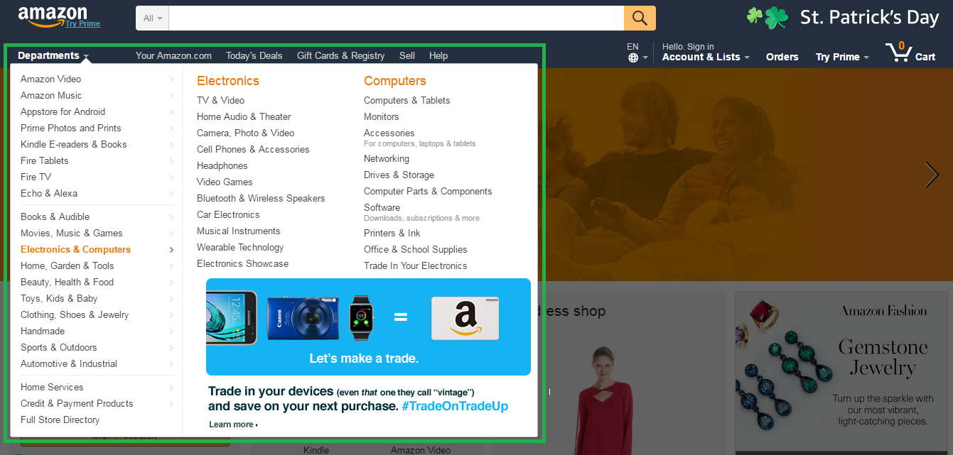
There should be a display products category on every page of the website, so visitors can easily browse any product categories throughout the entire website. It will enhance click-through rate and improve the sales of a website. If your site navigation is poor and they are feeling inconvenient to find their desired products then your visitors will never visit a website again.
The navigation system of your e-commerce is very important, it must be simple and spontaneous, the navigation between categories, subcategories, and products need not be complex or distracting, Arrange the breadcrumbs for the visitor, always led him to a particular product. Arrange also a button “back to home page” present on all pages and should be visible.
Personalize Experience
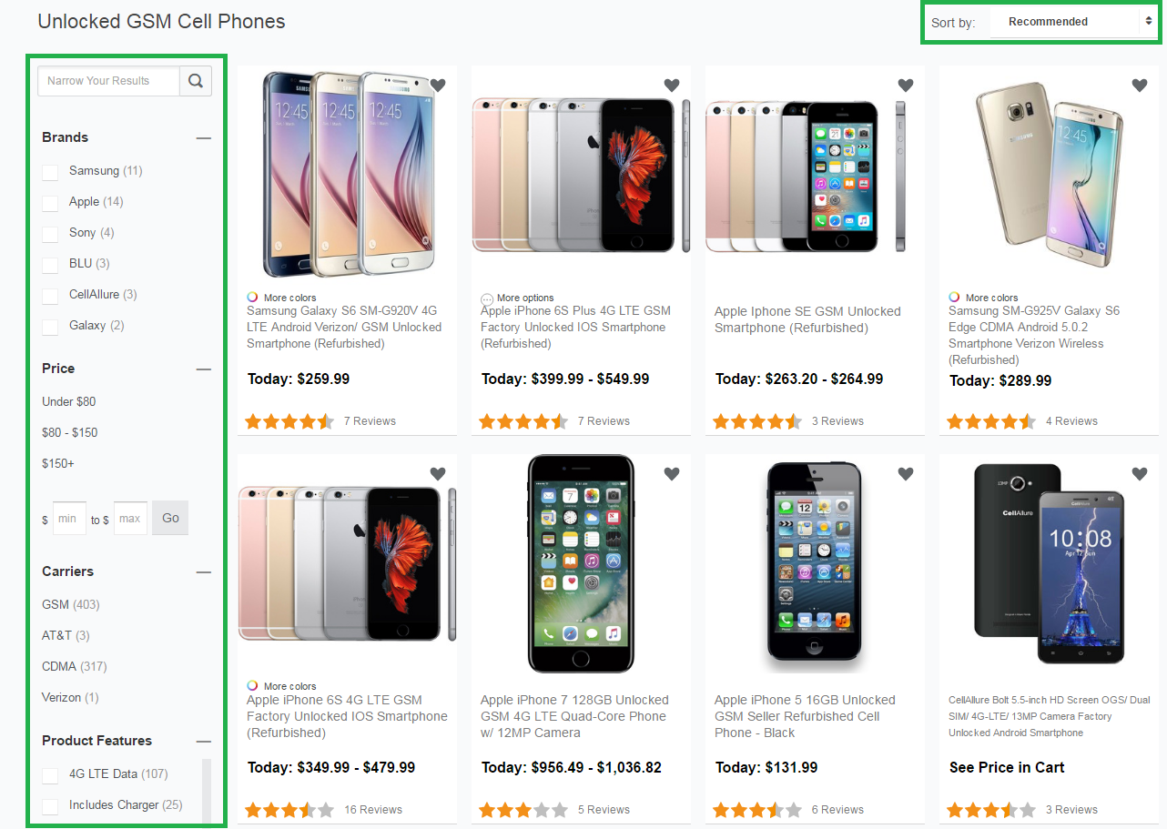
All visitors love to customize everything, especially the way they interact with the site. Let them decide how many products to display in lists, to sort them by brands, prices, availability, and to display products based on specific characteristics.
Search for Products
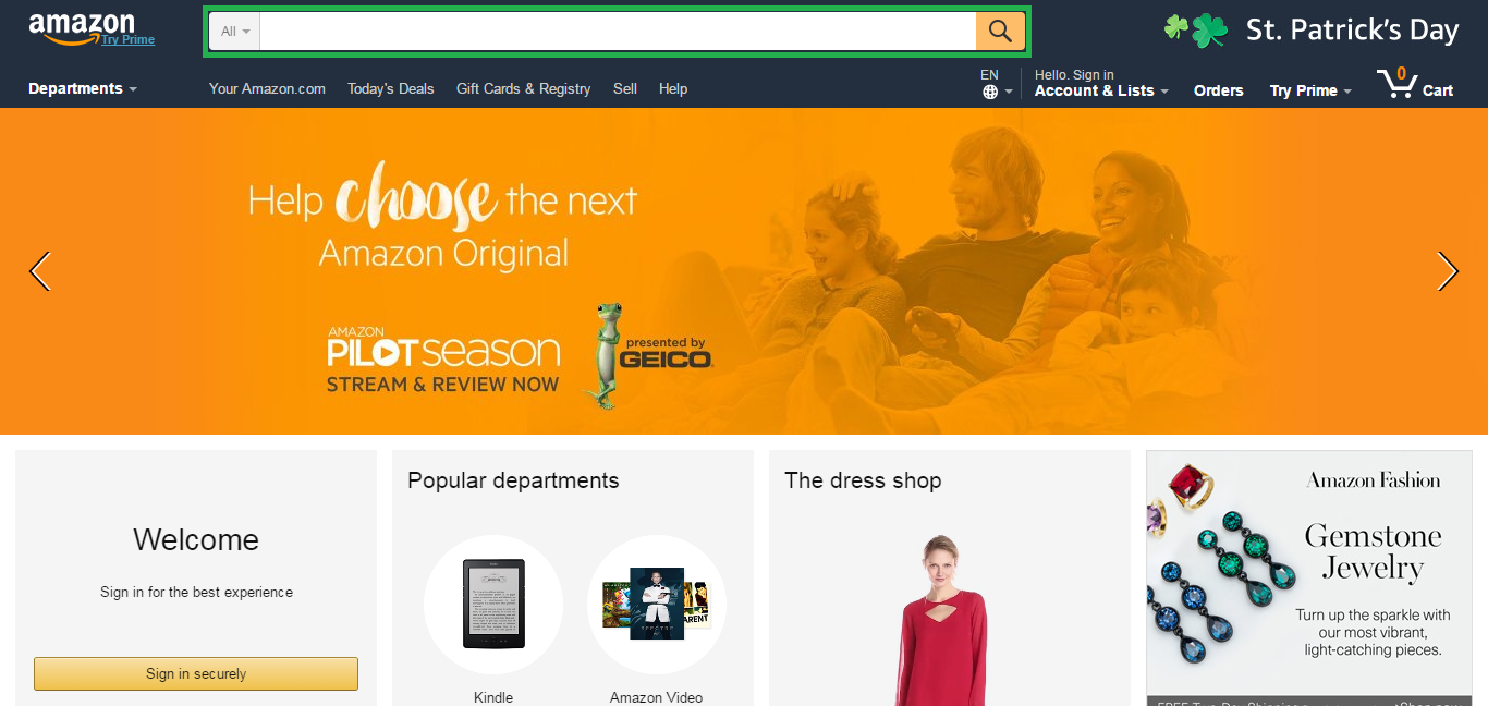
When customers wish to search for a particular product on your site, navigation should be well equipped with the search option for browsing products. The number of products available for a particular brand also helps customers to take a decision quickly. A bracket or box will help to find the product in a better way. To research, the products many (most definitely) users prefer an instrument to search for products rather than navigate using the menus and links. Make sure that the field is quite large and is positioned above the fold, perhaps in the header of the site.
Product Options
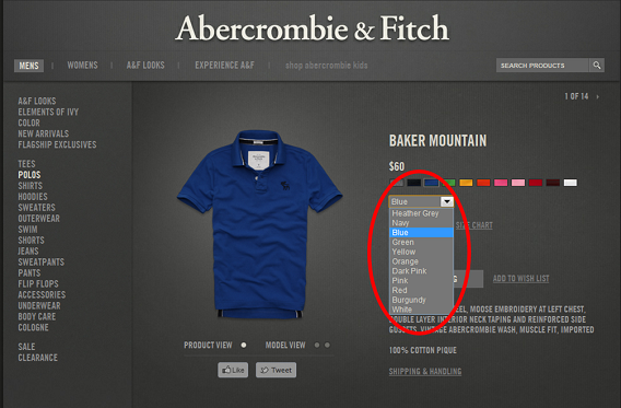
There must be a subcategory and relevant information of products like size, accessories, colors, zoom view of a product, etc. For each product, it is very important to show in clear and intuitive variants. For example, an e-commerce site that sells T-shirts, it is important to show the sizes and/or colors available. The visitor should be able to realize what variants are available and must be able to select the variant in a simple manner. A user who wants to buy a white shirt must be 100% sure that they are buying white (and the right size of course).
Availability of Products
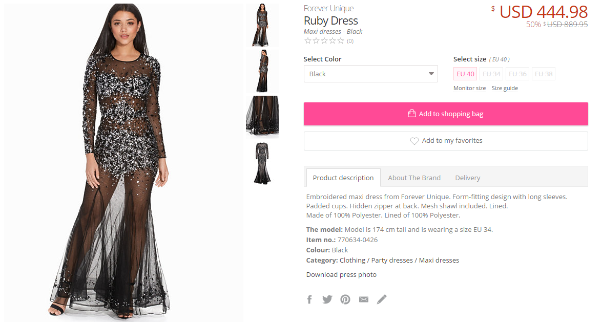
Please remove the unavailable product in product categories and never gimmick with the product price. Sometimes there are different prices on a front page and a product page when a customer visits your site. It will also create a bad impression of a website and the customer will go away from your website. It becomes ‘frustrating to find the unavailable product when you get the detail page, realize that the product is not available: waste of time! In the list of research, it quickly shows the availability of the product so that, the user can immediately realize if he can immediately buy the product or not.
Avoid Information Overload

Provide categories and subcategories for customers so he can find relevant products with best prices and discount offers. Having a home page with full of information may result in called an overload of information. Presenting hundreds of categories, thousands of products and many other things more or less useful is a poor choice. The “I will show you all at once” is harmful, the user is having in front of too much information gets “stunned” will not be able to focus on anything in particular, and may even decide to leave the site. Keep your home page “clean” and neat that should immediately show the “best” you have to offer.
Special Offers

Discount offer or free offers always attract visitors and influence them to buy products, as a result, the sale figure will increase in a short span of time. To push, or at least encourage the user to buy the product immediately viewed, you can create the type of special offers “by buying the related product one as a gift”, or “just this week the product is half price”. This kind of Offers will push customers to purchase immediately. Another possible solution is to influence the purchase indicating clearly the last pieces that are available and you have to buy them now before supplies run out altogether.
Multimedia
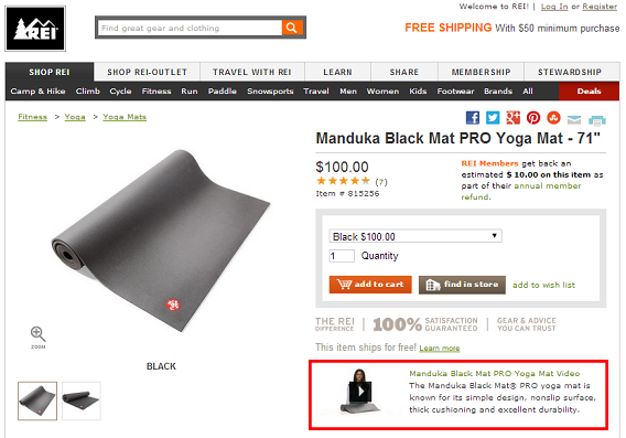
Videos can attract visitors quickly and they visualize the product in a video for better understanding. They can understand the operating functions, style, look etc through video streaming. Have you ever purchased on an e-commerce site that shows only a small picture, maybe even blurred, for each product? I never convince visitors to buy, they want to be sure of what they are buying, and there is nothing more useful for the purpose of a nice picture. Even the video could be useful, so make sure you show the product clearly through multimedia elements.
Optimize “Call-To-Action”
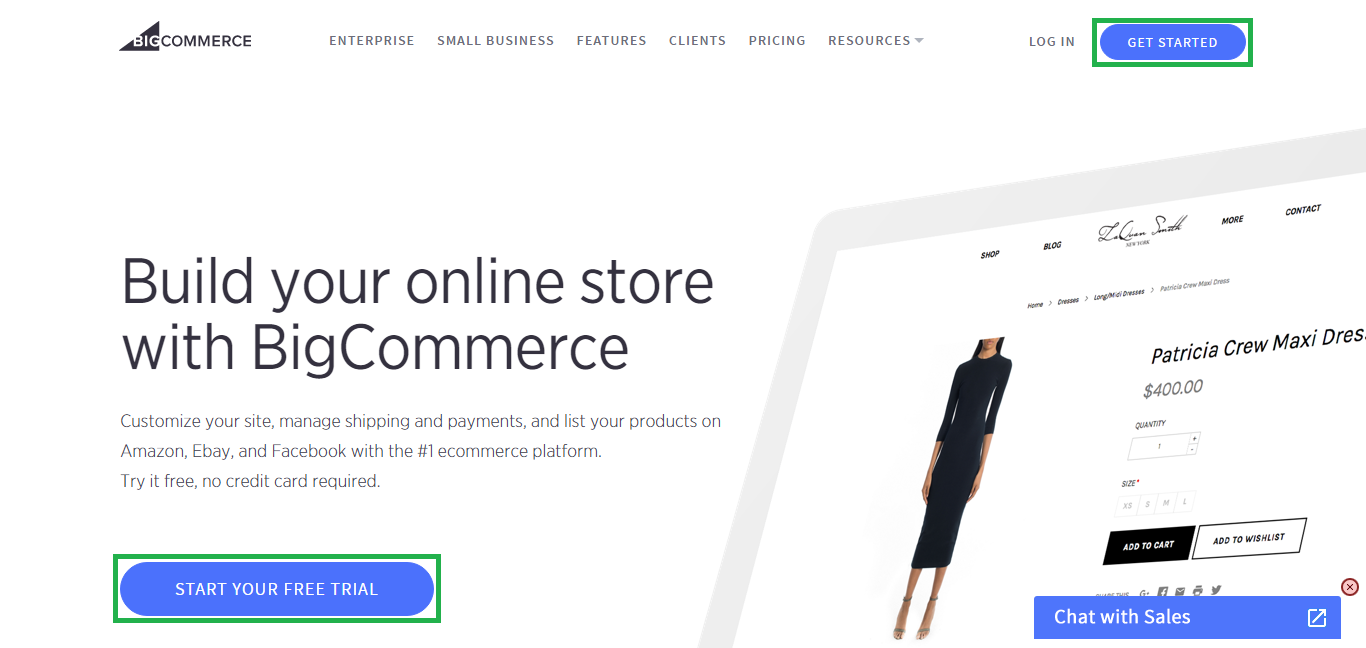
Optimize the call to action; means access to “add to cart” and “checkout” (or “buy out”) option. Buttons with different colors can make difference in the buying process and customers can simply find if he has made mistakes in the buying process. The message communicated by these buttons is important but also the shape and color can lead to different results depending on the choice made. For example, a button of blue or green color induces the user to click on the contrary that of the red, usually, indicates a web browser is associated with an error message or an alert.
Optimize Your Cart
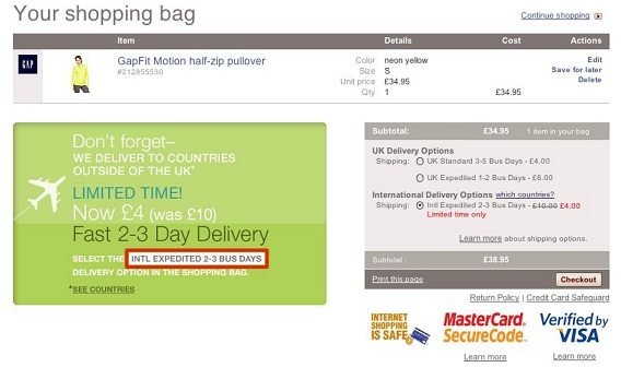
Make sure that “your cart” of your e-commerce is clearly visible and that is always present in all the pages of the site. Your website should address any additional options like shipping facility, payment option, and address details, in a prescribed format so users can easily deal with a website and enjoy online shopping. Optimize your cart in that way resulting in a memorable journey for your customers. The shopping cart should be easily accessible and informative. The customer, at any time, wishes to realize that how many items he added and what is the amount he is going to spend. You have to keep constantly informed of every action performed on the site.
Optimize Checkout Page
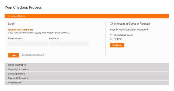
The checkout page is very important. The user has “shopped” and now is at checkout to complete the purchase. On this page, you have to encourage users to complete their deals. For this purpose, you need to optimize everything for the user not to be “distracted” and make forward to the button “Finish the Purchase” or “Pay Now”. Delete any item from this page, even navigation bars.
The user must only display the checkout process, in a clear and comprehensive manner. He must be able to read, on one page, all he needs to know to complete the payment: payment methods, shipping, billing, etc. Even today, many users are literally “frightened” by the online payments because of the news of scams that they read online or aware of being rather inexperienced in the web and its dynamics. Make the experience of checkout positive, fast and safe, in this way, the user will feel convinced to make future purchases relying on a checkout system simple and reliable.
If you also have experience in the field of online sales and e-commerce, can you give us more advice by sharing your experience via the comments?


